Tuesday, January 21, 2014

Analysing the Fed Model

What happened to the so-called Fed model? Although it was never actually endorsed by the Federal Reserve, the idea of comparing the 10-year Treasury yield and the earnings yield (earnings divided by price) on the S&P 500 (SNPINDEX: ^GSPC  ) has become a standard valuation tool for many investors. Moreover, for investors in SPDR S&P 500 (NYSEMKT: SPY  ) or the iShares Core S&P 500 (NYSEMKT: IVV  ) , a view on the value and future direction of the indexes is a critical part of investing. So how useful is the model, and what can investors learn from it?

Introducing the Fed model
As usual with valuation methodologies, there is no end of disagreement over which input factors to use. For reference, the earnings used in the following charts is as-reported, rather than adjusted. All of the raw data used comes from Noble prize winning economist Robert Shiller's website at Yale

The basic theoretical idea behind the model is simple. An investor faced with buying bonds or equities might choose between a 10-year U.S. Treasury yielding, say 5%, or buying an equity with an earnings yield (earnings/price) of 5%. Roughly speaking, when the Treasury yield is below that of equities then it makes sense to buy equities, and vice versa.

The following chart compares the long-term performance of these two variables. As a rough guide, when the earnings yield (in red) is above the 10-year Treasury yield (in blue) then equity markets are seen to be cheap and vice versa.


Yes, you are reading the chart correctly! The model is implying that the S&P 500 is a screaming buy right now. So does that mean that equity investors should just pile into index ETFs and enjoy the ride upward?

The answer depends on how much you trust the model.

A false friend
The model became popular in the '80s and '90s because it appeared to provide a very useful way to judge the future direction of the S&P 500. In fact, plotting the 10-year yield (x-axis) against the S&P 500 P/E ratio (y-axis) and performing a regression analysis on the data produces a remarkable result.

The best-fit trendline in the chart generates an equation with a coefficient of determination, or R^2, of 0.83; a result which indicates a very strong relationship. In plain English, the equation (rounded up) of y=0.98x-1.5 means that for a 10-year yield of, say 5%, the S&P 500 earnings yield should be equal to 0.98*5-0.015=4.9%. Since the earnings yield is the inverse of the P/E ratio, this implies a P/E ratio of around 20 times.


Source: Robert Shiller, author's analysis.

It's not hard to see why this metric became popular, because from 1980-2000 it appears to offer a failsafe way of investing in bonds or equities!

However, Foolish readers will note from the first chart that the relationship seems to break down after the year 2000. In fact, from 2003-2013 there is only one period where equities where not "cheap." That's 2009 when earnings (and therefore the earnings yield) collapsed during the recession.

Three explanations
There are many ways to interpret the relative cheapness of equities to bonds right now, or rather to interpret what the market is interpreting on the issue.

One approach suggests that bond yields are being artificially held down by massive injections of liquidity by the Federal Reserve. Therefore, equity investors may be saying that they don't really believe that equities are relatively cheap, because either interest rates will inevitably go up in a few years or earnings will fall in the future. Alternatively, both events could happen concurrently. For example, a collapse of confidence in lending to the U.S. could lead to Treasury yields rising, with damaging effects on corporate growth. However, if equity investors think that interest rates will go up, then why not just short bonds via something like the iPath US Treasury 10-year Bear ETN (NYSEMKT: DTYS  )

Another explanation is that investors are afraid of a cataclysmic event in the future, and don't wish to hold equities. Indeed, every recent global recession seems to have been deeper than the last. Moreover, the U.S. public debt situation is such that the U.S. (and the global economy) could face a severe and lasting depression if another recession takes place in the next few years.
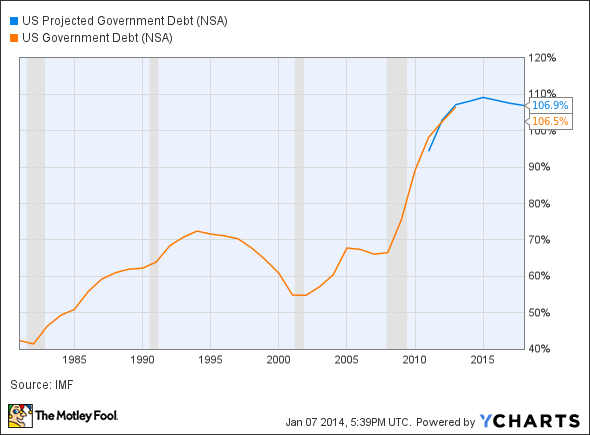
US Projected Government Debt Chart


The third explanation is that asset classes' valuations tend to be the product of a combination of fundamentals and waves of enthusiasm that come in to the sector. It was equities in the late '90s, then property in the early 2000s, then oil and commodities, then it was gold, and now it's emerging market bonds.

The bottom line
Unfortunately, the Fed model doesn't provide a catch-all solution to asset class allocation.  Any valuation method needs to be put into the context of the overall investment environment, and while it's easy to argue that the Fed model works under "steady state" conditions (such as between 1980-2000) it's a lot harder to predict when those conditions will come about again. Investing just isn't that simple.

Sunday, January 19, 2014

Protectionism on the Rise

Since the recession of 2008 the main debating point of the investment community has been over the possibility of a sustainable recovery in the global economy. However, this focus could lead many investors to be blindsided by the fact that increased protectionism has caused world trade to grow slower than global GDP. The repercussions have been directly seen in transportation plays like shipping company DryShips (NASDAQ: DRYS  ) and FedEx (NYSE: FDX  ) . Moreover, an increased climate of protectionism, led by countries such as India, also threatens prospects for companies as diverse as Cisco (NASDAQ: CSCO  ) and Pfizer (NYSE: PFE  ) .

Global trade growing slower than GDP
Over the last few months, three highly regarded institutions have highlighted the increasing growth of protectionism in the global economy. First, in an interview with CNBC television, World Trade Organization Director-General Roberto Azevedo outlined that the WTO would downgrade world trade growth estimates for 2013 from 3% to 2.5%. In addition, 2014 estimates would be cut from 5% to 4.5%. These would be done because of protectionism.

Second, the EU produced a report that highlighted a "worrying increase in the adoption of certain highly trade-disruptive measures." Interestingly, the emerging markets appear to be the worst culprits with Brazil, Argentina, and India cited in the report's conclusions.

Third, the International Air Transport Association argued that almost 500 protectionist measures were taken in 2012 alone.   Furthermore, data from the IATA clearly demonstrates that airplanes' cargo revenue and passenger revenue have diverged since the recovery took place. Cargo revenue is particularly susceptible to protectionism.


Source: IATA.

Transportation companies FedEx and DryShips affected
The immediate consequences can be seen in air cargo and transportation companies. For example, FedEx has undergone a remarkable transformation in profitability in recent years.


Source: Company presentations.

In recent years, FedEx has had to retire planes in its express segment because international express and cargo revenues have been less than hoped for.   The company still has good long-term growth prospects from e-commerce demand and its internal productivity improvement program. However, if a trade war escalates, then FedEx is likely to be a loser.

Moreover, the impact isn't restricted to air cargo. Shipping has also struggled, and a historically accurate predictor of the global economy, the Baltic dry index, has diminished in importance. The index is a measure of the shipping costs of moving raw materials. For example, here is a chart of the share price of Dry Ships vs. the Baltic dry index.

DRYS Chart

DRYS data by YCharts

Spot the correlation!

Shipping companies will be inordinately hit by a trade war, because they rely on future cash flows to at least offset the depreciation in the value of their shipping fleet.

Technology, pharmaceuticals, and consumer goods
A full-on trade war will obviously hurt the global economy, so most companies will be affected. However, smaller protectionist measures will hurt some companies more than others.

The U.S. is a major exporter of technology solutions, and Cisco is one of its leading players. Cisco just reported a very weak quarter for its emerging markets, and it's not clear if it was at least partly due to protectionist measures.

It would not be surprising if tit-for-tat measures were being taken by certain governments. In 2012, a U.S. House of Representatives report argued that Cisco's Chinese rivals Huawei and ZTE "could undermine core U.S. national-security interests," and went on to recommend that Huawei and ZTE be excluded for government work. While the U.S. may be completely justified in its actions, the potential repercussions should be considered by tech investors hoping for emerging market growth.

The pharmaceutical industry is another area of huge concern. Last year, Pfizer's chief intellectual property counsel, Roy Waldron, delivered a damning congressional testimony on the "rapid deterioration of the business environment in India." Waldron argued that India "demonstrates a flagrant disregard of patent rights." The revoking (twice) of its patents for cancer drug Sutent (while an Indian generic manufacturer launched its product on the market), and the denial of a patent to Pfizer's anticancer therapy Gleevec, were of particular concern. India stands accused of discriminating against U.S. companies in favor of supporting its own generic manufacturers, while its companies benefit from open markets in the U.S.

The bottom line
The rise in protectionism is a worrying trend in the global economy because everybody will suffer if it escalates. However, some industries will suffer more than most and long-term investors in the types of companies discussed above will need to keep an eye out for developments. In particular, countries such as India need focus more on halting their own creeping protectionism, rather than pointing fingers at others.

Wednesday, January 15, 2014

Equity Markets Set For a Strong 2014?

It's a new year, and Foolish investors' thoughts will naturally turn to the outlook for the S&P 500 (SNPINDEX: ^GSPC  ) and Dow Jones Industrial Average in 2014. One useful predictor of future market conditions is U.S. household net worth, because history suggests that so long as it's growing, then investors should feel optimistic about equity markets. However, when it stagnates, it's time to consider some downside protection.

The roaring 1980s
When it comes to U.S. household net worth, the warning indicator is two consecutive quarters in which the metric grows less than 1%. My earlier article goes through the basics of household net worth and outlines the evidence of its usefulness from 1960 to 1980. The graph below shows the relation between household net worth (numbers on the left-hand side) and the level of the S&P 500 (on the right-hand side).


Source: Federal Reserve, Yahoo! Finance, author's analysis.

The 1980s were notable because not once did net household worth growth less than 1% for two consecutive quarters. While this may seem unremarkable, take a close look at what happens at the end of 1987. The market experienced the famous Black Monday crash, when the Dow Jones fell more than 22% in one day in October. However, U.S. household assets weren't significantly affected, and the fact that there was no warning sign would have encouraged investors to stay in the market despite the trauma of Black Monday.

The 1990s
This graph picks up where the last one left off, marking three instances in the '90s when household net worth grew less than 1% for two consecutive quarters. These instances are marked along the blue line representing household net worth; the numbers above each instance indicate how many quarters each lasted.


Source: Federal Reserve, Yahoo! Finance, author's analysis.

The decade was a favorable environment for long investors, and although there were a few warning indicators, they weren't particularly strong, and investors' fortunes wouldn't have been significantly altered if they followed them. The important thing is to avoid significant downside.

From 2000 to 2013This is where it gets really interesting:


Source: Federal Reserve, Yahoo! Finance, author's analysis.

While there were only a couple of minor warnings from 2000 to 2003, the market dropped significantly in that period. Clearly, market valuations matter, too, and merely following household net worth isn't enough. Meanwhile, the indicator in Q4 2007 presaged six quarters of negative growth in net household worth and would have proved a useful signal to avoid the worst of the 2008-2009 crash.

Right now, however, the current situation looks favorable, as household net worth has risen nicely over the past couple of years.

Is this indicator valid?
In conclusion, the evidence is that following movements in US household wealth is a useful way to gauge the future direction of the market. However, the 2000-2003 period demonstrates that the indicator can't be looked at in isolation. Investors will need to feel comfortable with market valuations, as well as the underlying trends in the economy.

Foolish investors will also need to consider that each recession appears to be getting more and more severe, so this kind of warning system is well worth following, because if the trend continues, then the next recession could be quite nasty.

In addition, there have been plenty of periods where the indicator didn't signal a protracted decline. However, in these cases investors would not have missed out on much upside, either. It's not a perfect science, but it's a useful metric for investors to follow, and right now, it's indicating further gains for the markets in 2014.

Tuesday, January 14, 2014

Household Net Worth and The S & P 500

There is no such thing as a magic indicator that will tell you when to buy and sell the S&P 500 (SNPINDEX: ^GSPC  ) , and we Fools do not recommend timing the market. However, Foolish investors can use the following indicator to decide whether to be fearful of a sustained market fall or not. It can also help keep you from panicking in the event of a market dip.

Moreover, being cautious doesn't always have to involve selling out of the market. For example, you could always buy some downside protection for your portfolio with a short ETF like the Short S&P Pro-Shares (NYSEMKT: SH  ) ETF or get some protection from volatility with the ProShares Ultra VIX Short-Term ETF (NYSEMKT: UVXY  ) . You could even increase your bond holdings (which can outperform in a recession) with Vanguard's Total Bond Market ETF (NYSEMKT: BND  ) .

Household net worth and the S&P 500
The idea is simple. Most economic trends will usually manifest themselves in a change in U.S. household net worth. In turn, how U.S. households feel about their finances will affect consumption, real-estate markets, business investment, and a whole host of factors that influence the stock market. In other words, follow U.S. household net-worth trends, and you are following a sentiment indicator for the S&P 500.

The Federal Reserve publishes this data on its website. The data comes out a quarter after the period in question, but no matter -- this analysis is for strategic considerations, not for market timing.

In the graphs I use to illustrate this indicator, the correlation between household net worth and stock market performance shows when sequential growth in U.S. household net worth is below 1% for at least two running quarters.

The 1960s
There were two instances in which this correlation showed during the 1960s. The first was in Q1 of 1962, and it's a short trend only lasting two quarters. Moreover, Foolish investors should note that the S&P 500 fell 16.8% in Q2, and this surely had a negative influence on net worth. However, this impact didn't last.. In fact, net household worth then increased by 1.8% in Q3 of 1962 and by 4.8% in Q4.

Those who waited for a good quarter or two to confirm that net household wealth was rebounding were probably optimistic again when the S&P 500 reached about 66 points. In a sense, the indicator tells you not to worry too much about a stock market fall, because it isn't really caused by, or even creating, any significant drop in wealth.

The numbers on the left-hand side refer to household net worth, and the numbers on the right-hand side show the level of the S&P 500. The numbers in the middle of the graph show how many consecutive quarters saw household net worth grow by less than 1%.


]Source: Federal Reserve, Yahoo Finance, author's analysis.

The second slowdown in household-net-worth growth lasted for six quarters, during which the S&P dipped at least 20% before it went up again.

1970s
While the 1970s began in a negative fashion, it only took three quarters before U.S. household net worth starting growing sequentially by more than 1%, with 3.4% growth recorded in Q3 1970. As the data is reported in Q4, the S&P 500 is likely to have stood around 95. The S&P 500 index then rose nicely until household-net-worth growth slowed to 0.5% in Q1 of 1973 and 0.8% in Q2.

While it's true that household-net-worth growth of 3.8% in Q3 1973 was something of a false friend -- it would have encouraged you to be optimistic around the 96-point level -- note that the cautionary indicator gave another signal in the next quarter at about 90. Furthermore, the index falls to the low 70s in the quarters afterward.

When data was released that demonstrated U.S. household net worth trending positive again, the index bounced back to about 87. Again, you would have missed some upside with the bounce-back, but you also missed the pain of the violent drop in the markets beforehand..


Source: Federal Reserve, Yahoo Finance, author's analysis.

Perhaps the most important point is that net worth increases nicely from the mid 1970s onwards, thus encouraging long-term investors to stay in the market and buy on the dips. While the increase in net worth in the 1970s is somewhat illusory in real terms (because of inflation), stock prices should go up with inflation, too.

The bottom line
In conclusion, there is scant evidence from the 1960-1980 period to suggest that this indicator is useful for market timing, but it does appear to be a useful primer for thinking about some downside insurance in the form of the ETFs mentioned earlier. Insurance can be bought by hedging your portfolio with some short ETFS as mentioned above. Alternatively, if you are worried about a sudden and violent drop, then buying a volatility ETF may benefit you. If you are worried about a protracted slowdown, then bonds could outperform, so a bond ETF might fit the bill.

For long-term investors, the indicator simply provides a good read on the underlying strength of the economy, particularly in periods where the index is indicating weakness. In other words, it will encourage you to stay in the market when short-term noise suggests otherwise. 

In the next article, I will cover the 1980-2013 period, revealing an amazing fact about the 1987 stock market crash, demonstrating how this indicator would have helped you in 2008, and ultimately arguing why investors should stay bullish right now.